Google’s New Logo Is a Sign of Where the Company Is Headed
Google is shaking things up again, rolling out a new logo that indicates where the company is going even as it keeps the colored letters that have become so familiar. The company’s most significant redesign since 1999 does away with the old font and its serifs (those little lines at the end of each character) and replaces them with the same custom typeface used in the logo for Google’s new parent company, Alphabet.
The new look does more than just make the logo sleeker and more modern while echoing the newly created holding company. It also speaks to where Google is going — namely, its increasing presence on our mobile devices. Google’s Vice President of Product Management Tamar Yehoshua and Director of User Experience Bobby Nath explained the transition on the company’s blog:
“Once upon a time, Google was one destination that you reached from one device: a desktop PC. These days, people interact with Google products across many different platforms, apps and devices—sometimes all in a single day. You expect Google to help you whenever and wherever you need it, whether it’s on your mobile phone, TV, watch, the dashboard in your car, and yes, even a desktop!”
Related: 10 Biggest Tech Flops of the Century
Google said in May that the number of searches on mobile devices had surpassed those on computers in 10 countries, including the U.S. and Japan. Its simplified new logo will load faster and read better “even on the tiniest screens.” And when six letters are still too much to fit on one of those tiny screens, the company will present a four-color “G” icon that matches its new logo, or four animated dots that morph into other forms; the swirling new feature is meant to “represent Google’s intelligence at work and indicate when Google is working for you,” according to a post on Google’s Design blog.
In other words, they’re a tiny bit of swirling fun that will placate you as you wait for your information to load — and remind you that you’re using a Google service and not some other company’s product. Together, the new logo, the new “G” icon and the colored dots are Google’s way to keep stamping its brand on our increasingly mobile world.
Top Reads from The Fiscal Times
- Why McDonald’s could Suddenly Be Responsible for Millions of New Employees
- The 10 Worst States for Property Taxes
- U.S. Companies Are Dying Faster than Ever
Coming Soon: Deductible Relief Day!

You may be familiar with the concept of Tax Freedom Day – the date on which you have earned enough to pay all of your taxes for the year. Focusing on a different kind of financial burden, analysts at the Kaiser Family Foundation have created Deductible Relief Day – the date on which people in employer-sponsored insurance plans have spent enough on health care to meet the average annual deductible.
Average deductibles have more than tripled over the last decade, forcing people to spend more out of pocket each year. As a result, Deductible Relief Day is “getting later and later in the year,” Kaiser’s Larry Levitt said in a tweet Thursday.
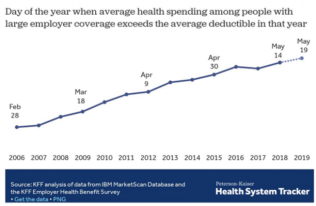
Chart of the Day: Families Still Struggling

Ten years into what will soon be the longest economic expansion in U.S. history, 40% of families say they are still struggling, according to a new report from the Urban Institute. “Nearly 4 in 10 nonelderly adults reported that in 2018, their families experienced material hardship—defined as trouble paying or being unable to pay for housing, utilities, food, or medical care at some point during the year—which was not significantly different from the share reporting these difficulties for the previous year,” the report says. “Among adults in families with incomes below twice the federal poverty level (FPL), over 60 percent reported at least one type of material hardship in 2018.”
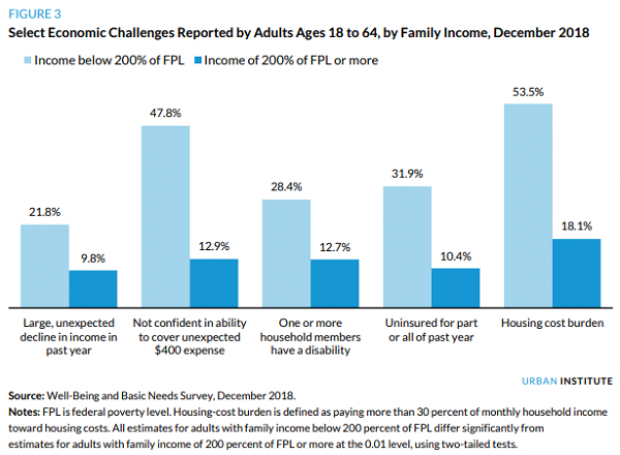
Chart of the Day: Pragmatism on a Public Option
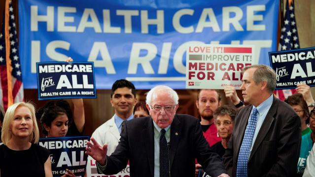
A recent Morning Consult poll 3,073 U.S. adults who say they support Medicare for All shows that they are just as likely to back a public option that would allow Americans to buy into Medicare or Medicaid without eliminating private health insurance. “The data suggests that, in spite of the fervor for expanding health coverage, a majority of Medicare for All supporters, like all Americans, are leaning into their pragmatism in response to the current political climate — one which has left many skeptical that Capitol Hill can jolt into action on an ambitious proposal like Medicare for All quickly enough to wrangle the soaring costs of health care,” Morning Consult said.
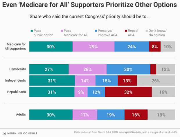
Chart of the Day: The Explosive Growth of the EITC

The Earned Income Tax Credit, a refundable tax credit for low- to moderate-income workers, was established in 1975, with nominal claims of about $1.2 billion ($5.6 billion in 2016 dollars) in its first year. According to the Tax Policy Center, by 2016 “the total was $66.7 billion, almost 12 times larger in real terms.”

Chart of the Day: The Big Picture on Health Care Costs

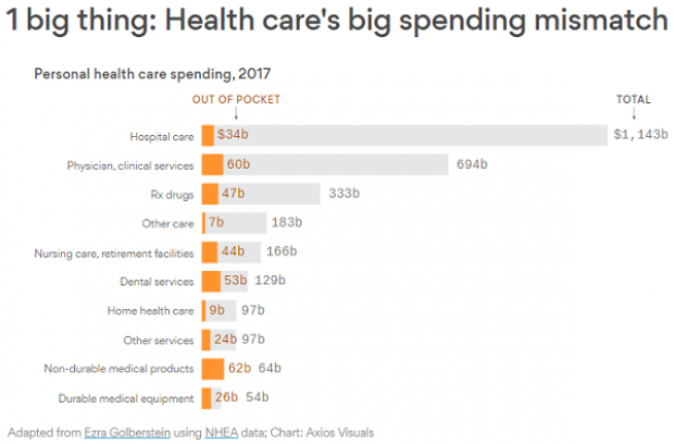
“The health care services that rack up the highest out-of-pocket costs for patients aren't the same ones that cost the most to the health care system overall,” says Axios’s Caitlin Owens. That may distort our view of how the system works and how best to fix it. For example, Americans spend more out-of-pocket on dental services ($53 billion) than they do on hospital care ($34 billion), but the latter is a much larger part of national health care spending as a whole.